Edge Connect
Market-entry UX and website for a fintech launching into a crowded, technical sector

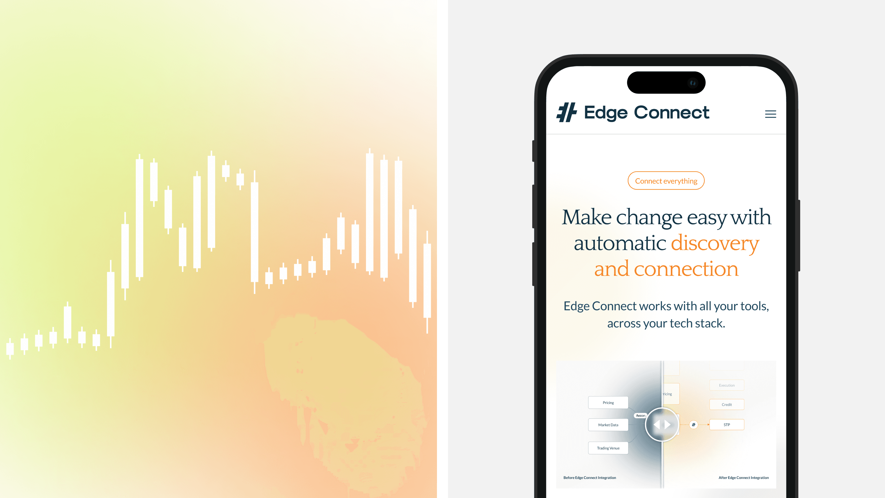
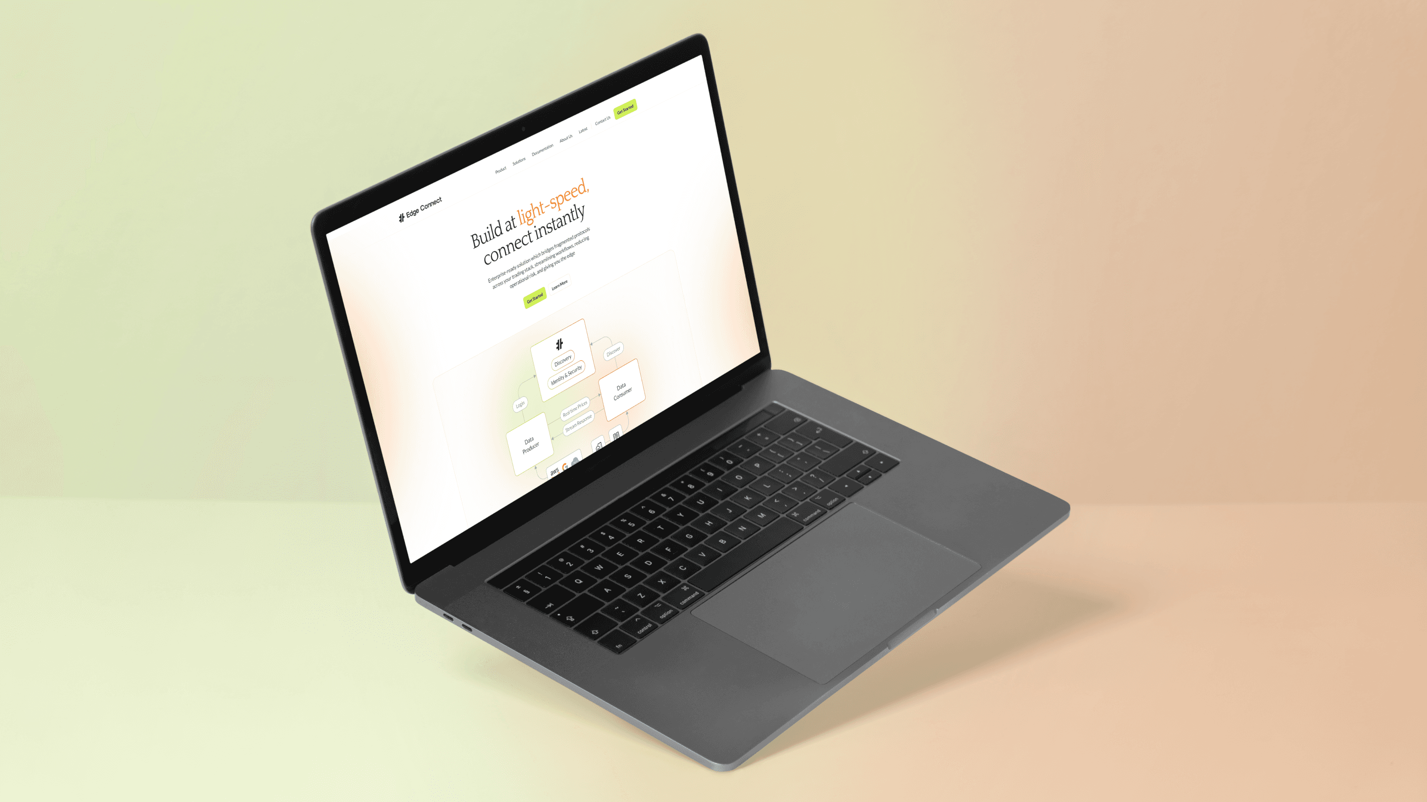
Developed and launched the strategic web design and UX for Edge Connect's UK market launch - translating complex trading infrastructure into a site that developers and CTOs can evaluate at speed.
Sector
B2B Fintech / Payment Infrastructure
Services
UX Strategy
Website Design
Market Analysis
LIVE SITE
Brief
Launching developer-first infrastructure into one of fintech's most technical B2B categories
Edge Connect is a real-time connectivity platform that bridges fragmented protocols across financial trading stacks, founded by engineers from JPMorgan, Citibank, and BBVA. The audience is technical - software engineers, CTOs, and platform architects at financial firms - and the brief was the digital presence for market entry: credible to engineers, navigable to senior buyers, ready from launch.
Insight
In a category over-signalling competence, clarity was the differentiator
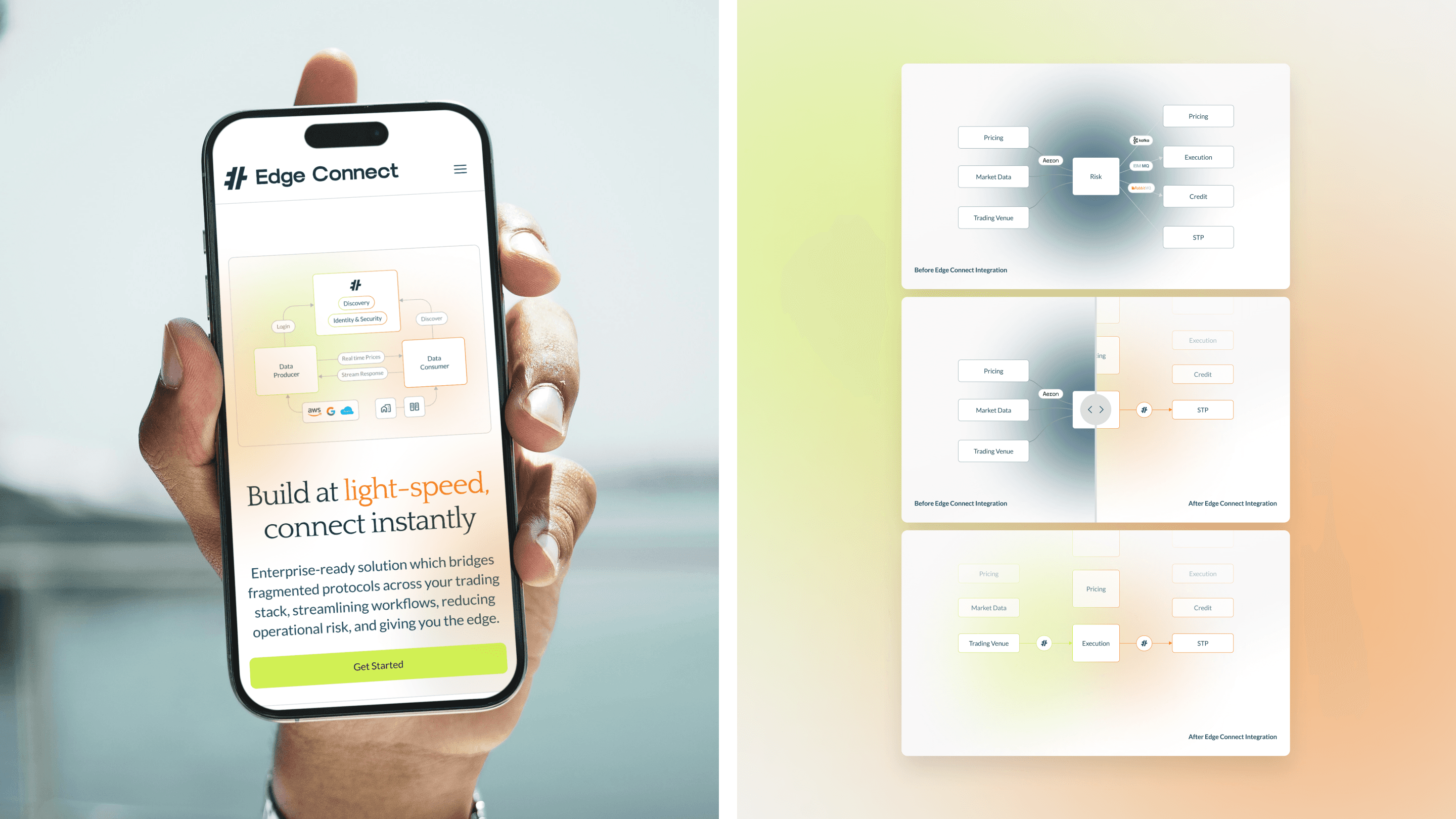
In trading infrastructure, competence is expected - most competitors signal it through complex feature comparisons, which engineers can't process during an initial scan. Industry context the founding team brought to the work made the deeper point: most of the engineering pain in this category isn't connectivity speed, it's integration and change management. That reframed the brief. The strategic move was to lead with the engineering reality Edge Connect actually addresses, show the before-and-after visually rather than describing it, and design for legibility.
Build
A digital presence designed for legibility, not technical sophistication
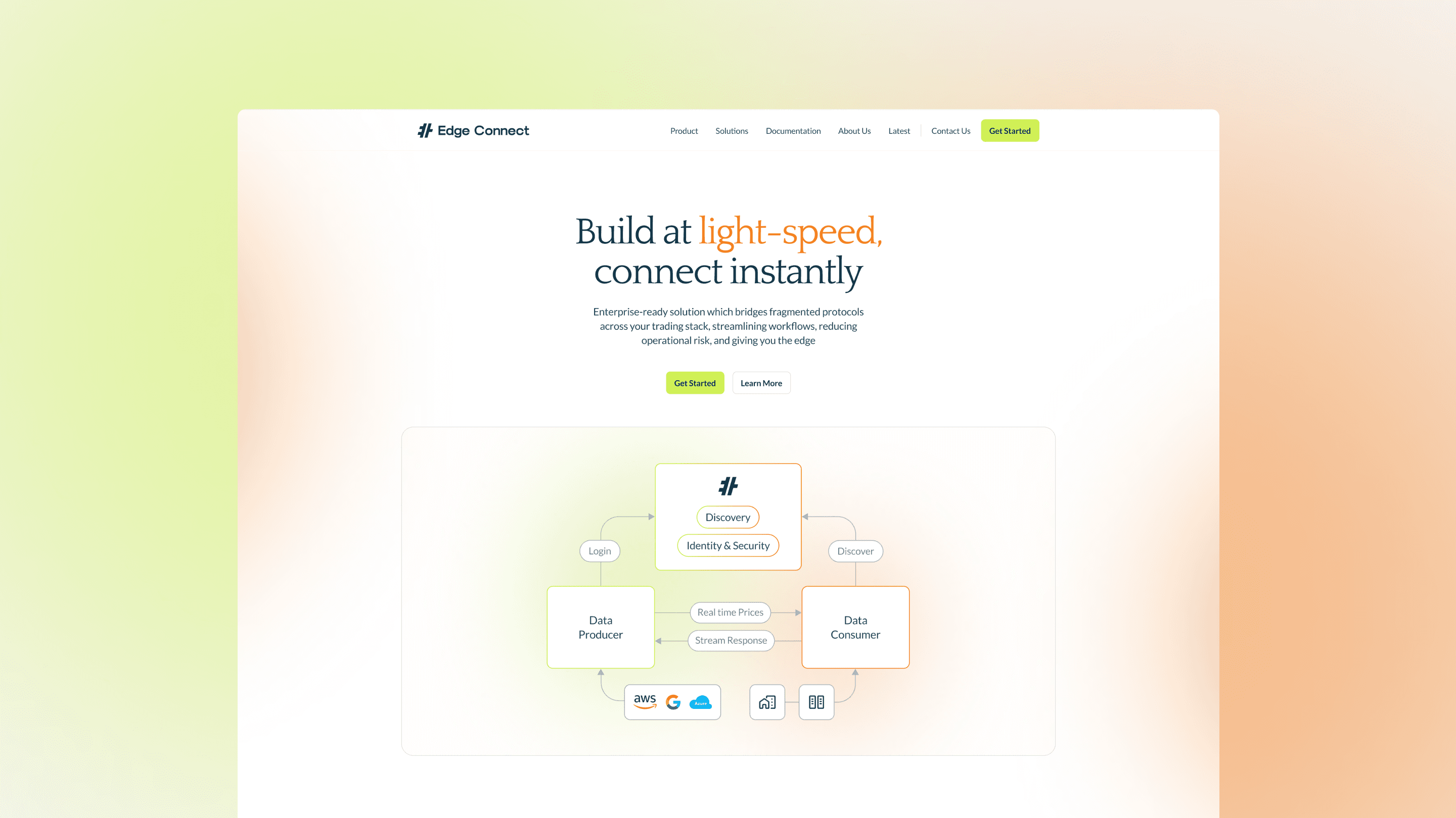
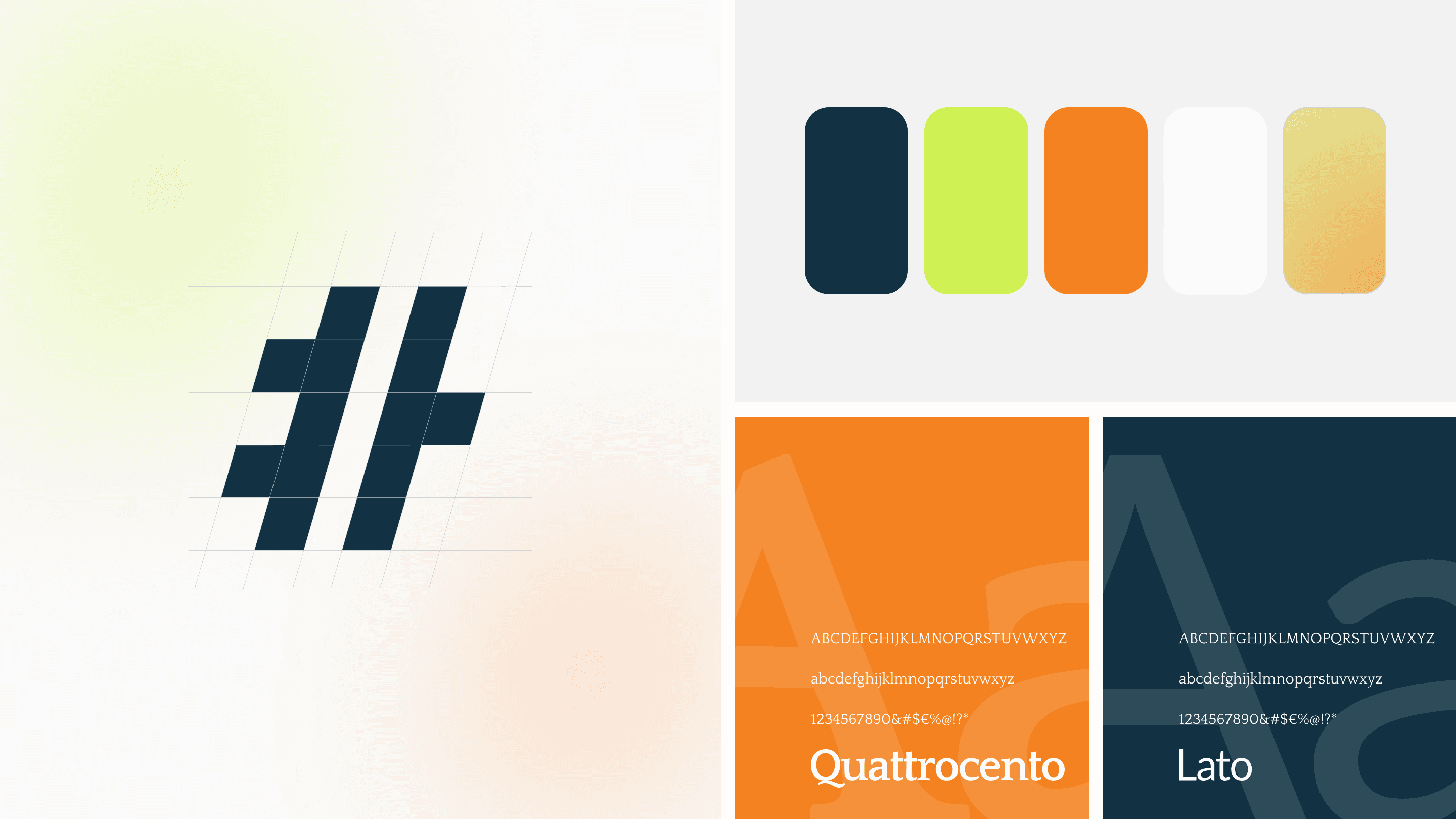
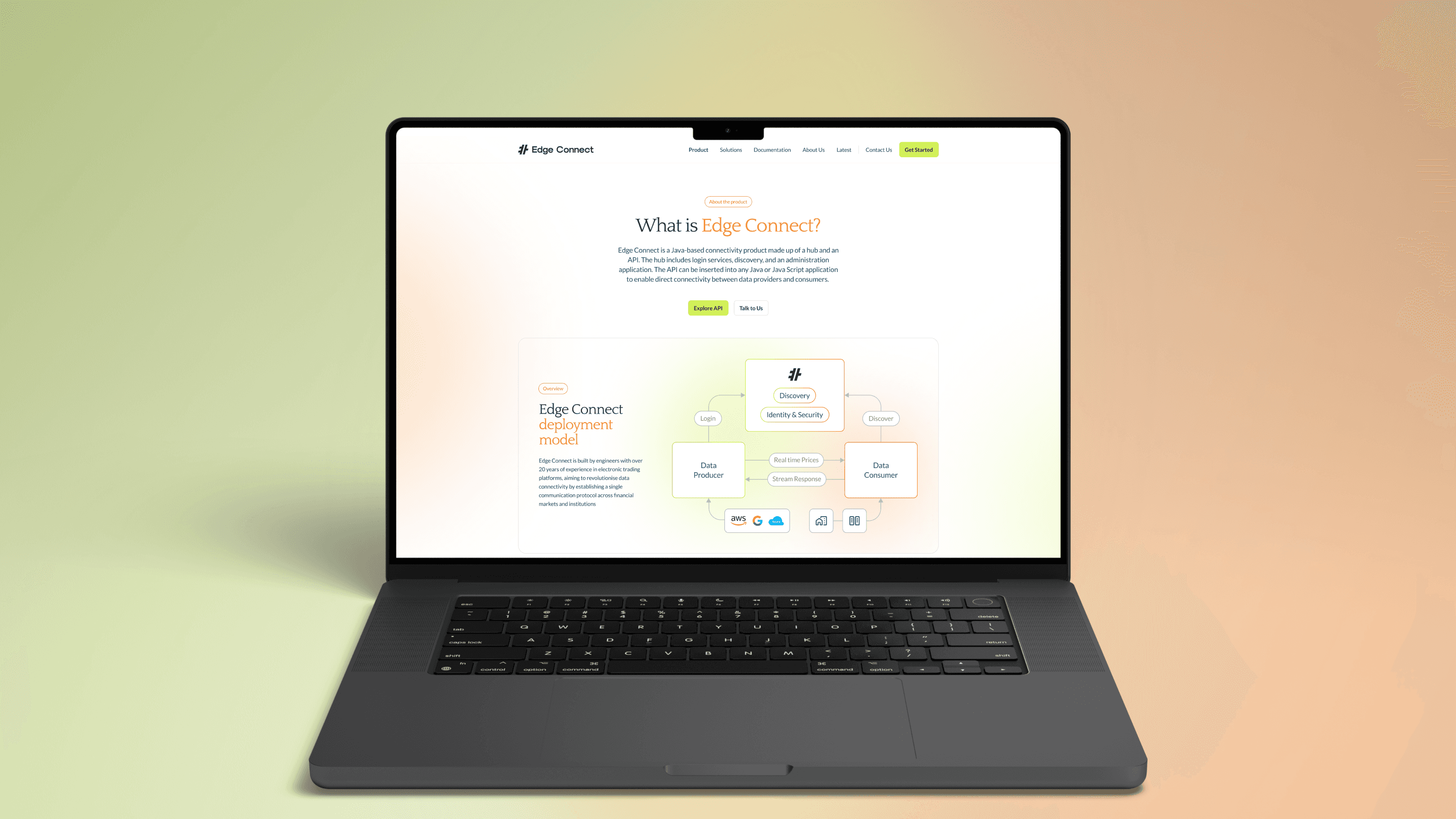
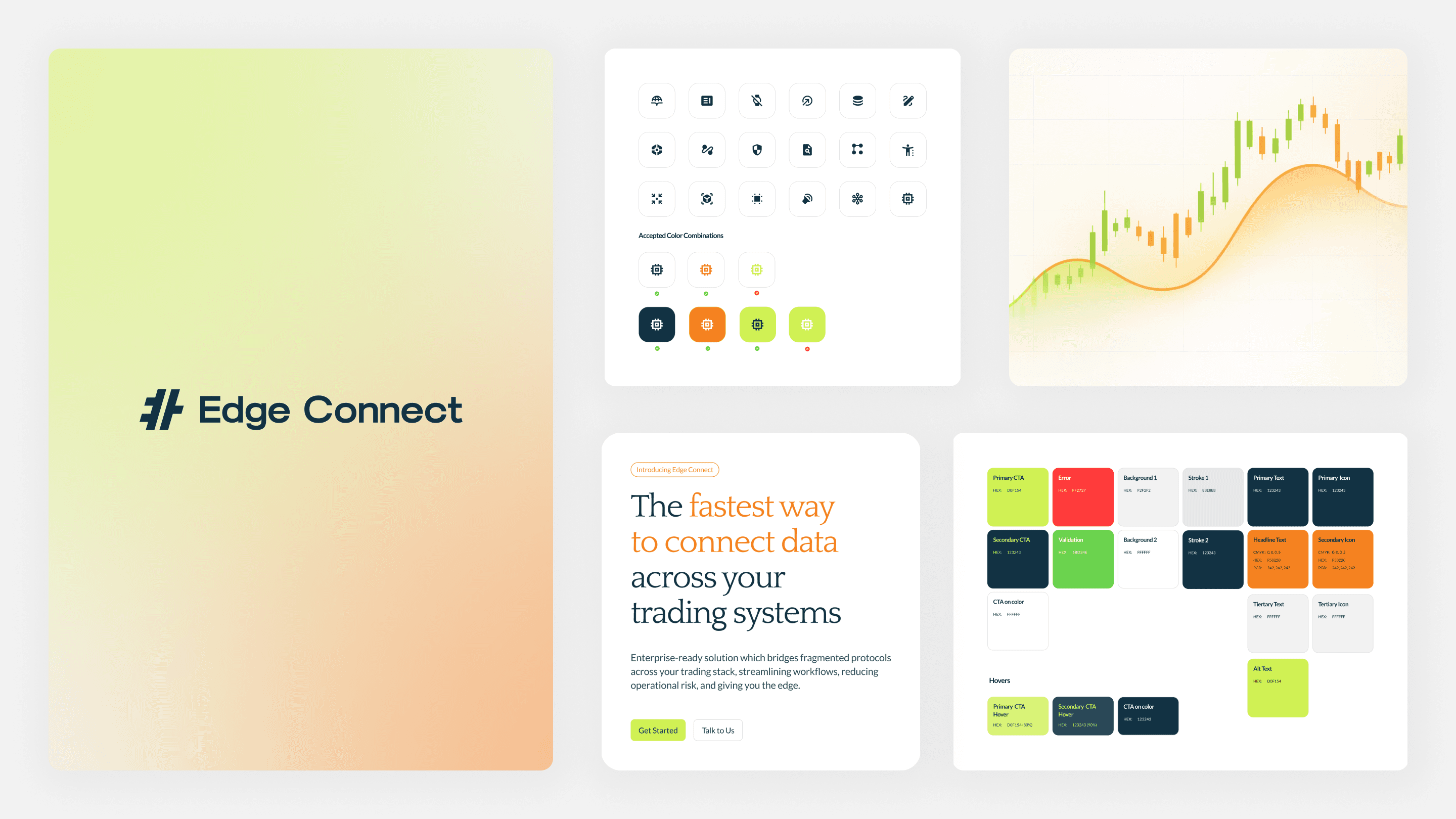
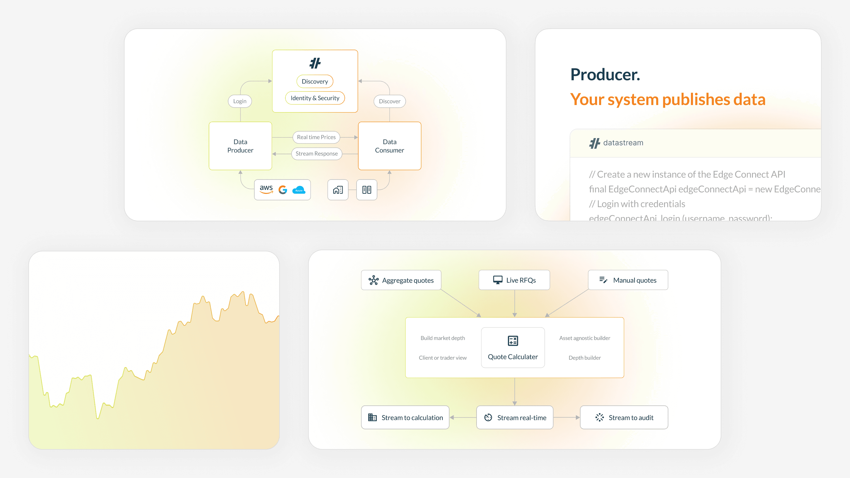
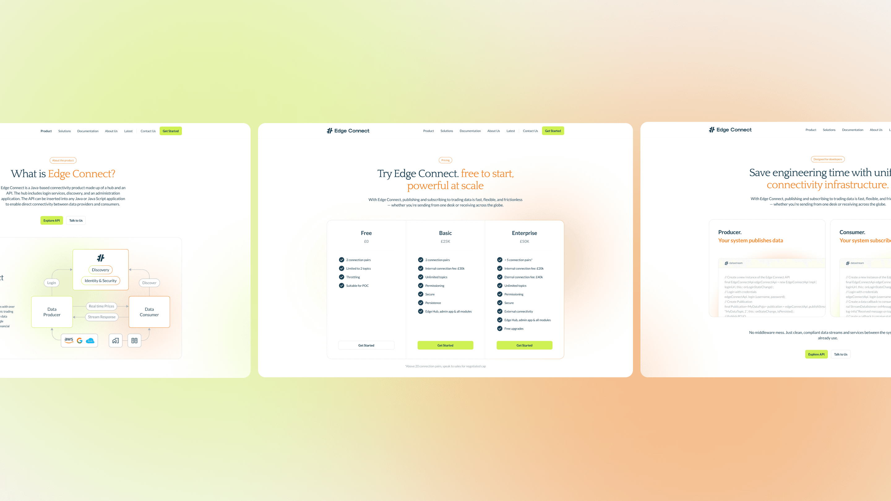
Led the UX and design as part of Goldfish Agency's wider market-entry programme, designed end-to-end in Figma from wireframes through to final build. The site is sequenced around the engineer's evaluation order - what it solves, how it works, what integration looks like, how to start - with structured visuals translating the underlying infrastructure into scannable diagrams of network discovery, before-and-after integration, and distributed services. The visual register sits deliberately against the category's default corporate blue, using a soft orange-and-green accent and gradient system, spacious layout, and the kind of restraint that signals technical confidence without saying the word. The conversion flow was built directly into the homepage - download the starter package, run the API, connect your first stream - removing the standard B2B fintech friction of "talk to sales before seeing the product".
Outcome
Market entry credibility from launch in a category where most look indistinguishable
The site translates Edge Connect's infrastructure into something developers can evaluate at speed and senior buyers can navigate confidently, holding visually against established competitors in the category. Live and serving as Edge Connect's launch digital presence for UK market entry.